Open-source React component library, styled with TailwindCSS.
Overview
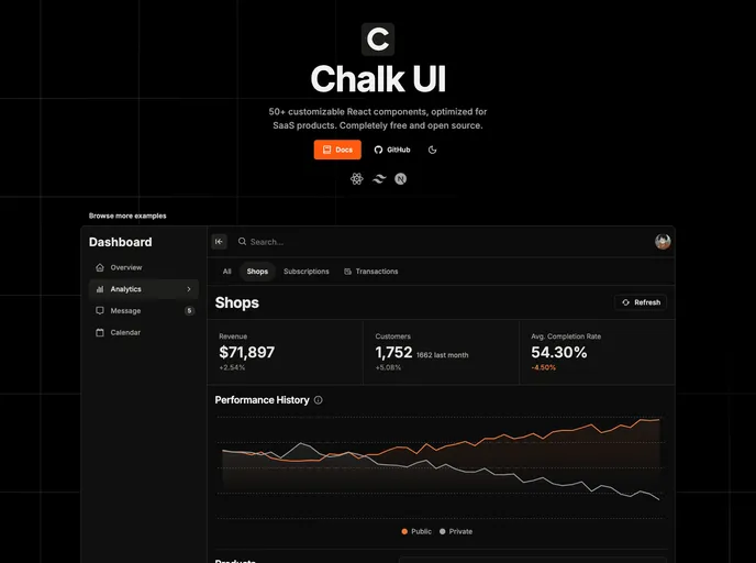
Chalk UI is a reusable and customizable set of Tailwind components that comes with a CLI (Command Line Interface). It provides a wide range of components for building user interfaces, along with documentation and a CLI tool for easy installation and maintenance.
Features
- Alert: Display informative messages to users.
- Avatar: Show user profile pictures or icons.
- Badge: Highlight important information or statuses.
- Page Header: Create headers for different pages.
- Button: Add interactive buttons for user actions.
- Close Button: Allow users to close or dismiss elements.
- Icon Button: Use icons as interactive buttons.
- Skeleton: Display temporary loading placeholders for content.
- Calendar: Show a calendar for date-related operations.
- Modal: Create pop-up windows for additional content.
- Drawer: Slide out side menus for navigation or options.
- Loading Spinner: Indicate loading or processing actions to users.
- Loading Overlay: Show loading states over a specific area.
- Accordion: Display collapsible content sections.
- DropdownMenu: Show a list of options when clicking a button.
- Popover: Create pop-up tooltips or information boxes.
- NavigationTabs: Display tabbed navigation elements.
- TabPanels: Show different panels based on selected tabs.
- Tooltip: Provide additional information on hover.
- Breadcrumbs: Show a navigational path of the current page.
- Typography: Use predefined text styles and formatting.
- Banner: Display visually appealing banners or promotional messages.
- Charts: Create interactive charts and data visualizations.
- Stats: Show numeric statistics or metrics.
- Pagination: Split content into multiple pages for easier navigation.
- Toast: Display temporary messages or notifications.
- Timeline: Present events or milestones in chronological order.
- Paper: Create containers with a bordered or shadowed look.
- Card: Display information or feature sets within a card layout.
- Navbar: Create navigation headers for websites or applications.
- VerticalNav: Show a vertical menu for navigation options.
- HorizontalNav: Display a horizontal menu for navigation options.
- AppLayout: Define the overall layout structure of an application.
- Header: Create the header section of a page or application.
- Sidebar: Show a side panel for additional content or menu options.
- Content: Define the main content area of a page or application.
- Section: Divide content into sections for better organization.
- DataGrid: Display data in a tabular format with sorting and filtering options.
- Form: Create input forms for user data entry.
- Text Input: Allow users to type single-line text.
- Textarea: Enable multi-line text input.
- Number Input: Accept numerical values from users.
- Address Input: Capture address information from users.
- Price Input: Input field for monetary values.
- Phone Number Input: Accept phone number input from users.
- Multi Select Input: Allow users to select multiple options from a list.
- Combobox: Combine dropdowns and text inputs for enhanced selection.
- Switch: Allow users to toggle between two states.
- Checkbox: Enable users to select or deselect options.
- Checkbox Group: Present multiple related checkboxes together.
- Select: Show a dropdown menu for single option selection.
- Radio Group: Present multiple related radio buttons together.
- Date Picker: Allow users to select dates from a calendar.
- Date Range Picker: Enable users to select a range of dates.
- Time Input: Accept time values from users.
- Color Picker: Allow users to choose colors.
- File Input/Dropzone: Enable file uploads or drag-and-drop functionality.
- Typesafe Form: Provide type safety and validation for form inputs.
- Image Grid Input: Allow users to select images in a grid layout.
- Transfer List: Enable users to move items between two lists.
- JSON Input: Accept JSON input from users.
- i18n (For certain components): Provide internationalization support.
- English: Support for the English language.
- French: Support for the French language.
- Tests: Unit and integration tests for the components.
Installation
To install Chalk UI, follow these steps:
- Fork the Chalk UI repository.
- Clone the forked repository to your local machine.
- Navigate to the project directory.
- Install the required dependencies by running the following command:
- Start the development server by running the following command:
- You can now access Chalk UI in your browser at http://localhost:3000.
Summary
Chalk UI is a powerful and versatile collection of Tailwind components that can be customized and reused to build user interfaces. With its extensive list of components and the convenience of a CLI tool for easy installation and maintenance, Chalk UI provides developers with a robust foundation for creating visually appealing and functional web applications. Whether you need simple buttons and forms or complex data grids and navigation menus, Chalk UI has got you covered.