Admin UI Kit with Material UI & React. 2 stunning dashboards, 9 ready-to-use applications, Redux toolkit integration, Axios mock API and Figma design files included.

shadcn/ui is a collection of beautifully designed, accessible, and customizable UI components for React, built on top of Radix UI and styled with Tailwind CSS. Shadcn revolutionized UI libraries with a copy-paste model, giving developers full control without dependencies. Its component registry l...

Storybook is the industry standard workshop for building, documenting, and testing UI components in isolation

An open source collection of animated, interactive & fully customizable React components for building memorable websites.

Completely unstyled, fully accessible UI components, designed to integrate beautifully with Tailwind CSS.

HeroUI is a UI library for React that helps you build beautiful and accessible user interfaces. Created on top of Tailwind CSS and React Aria.

Beautiful, fast and modern React UI library for building accessible and customizable web applications (Formerly Next UI).
Beautiful & consistent icon toolkit made by the community. Open-source project and a fork of Feather Icons.

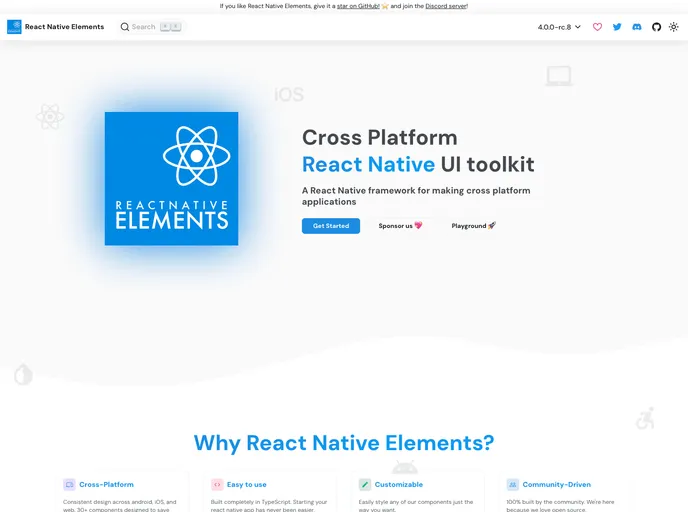
Mobile-first, accessible components for React Native & Web to build consistent UI across Android, iOS and Web.

UI Library for Design Engineers. Animated components and effects you can copy and paste into your apps. Free. Open Source.

Radix Primitives is an open-source UI component library for building high-quality, accessible design systems and web apps. Maintained by @workos.

A collection of libraries and tools that help you build adaptive, accessible, and robust user experiences.

Style React fast with 100% parity on React Native, an optional UI kit, and optimizing compiler.

:boom: React Native UI Library based on Eva Design System :new_moon_with_face::sparkles:Dark Mode

Radix Themes is an open-source component library optimized for fast development, easy maintenance, and accessibility. Maintained by @workos.

General IM UI components. Android/iOS/RectNative ready. 通用 IM 聊天 UI 组件,已经同时支持 Android/iOS/RN。

UI kit to make beautiful, animated interfaces, faster. Customizable. Open Source.

npm for design engineers: largest marketplace of shadcn/ui-based React Tailwind components, blocks and hooks

React + Vue Search UI for Elasticsearch & Opensearch. Compatible with Algolia's Instantsearch and Autocomplete components.

React & React Native Components & Patterns (copy-paste components & patterns crafted with Tailwind CSS (NativeWind))
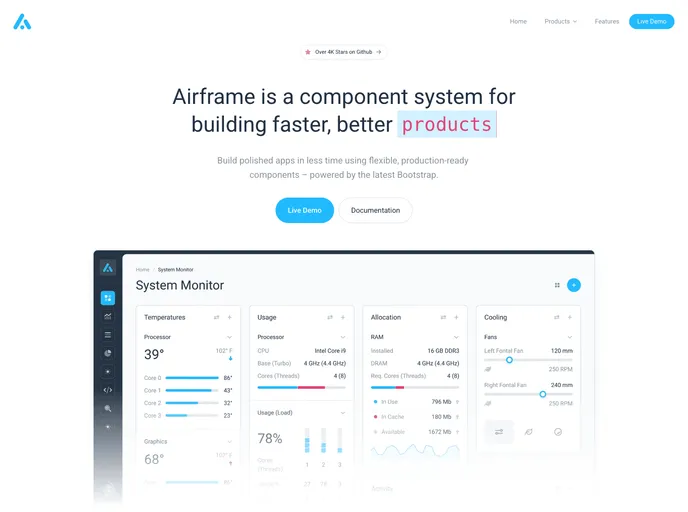
Free Open Source High Quality Dashboard based on Bootstrap 4 & React 16: https://airframe-react-lime.vercel.app

Beautiful and responsive UI components and templates for React and Vue (soon) with Tailwind CSS.

Components crafted for Design Engineers. Styled using Tailwind CSS, fully compatible with Shadcn, and easy to integrate—just copy and paste. MIT

Tail-kit is a free and open source components and templates kit fully coded with Tailwind css 3.0.

React content transition slider. Awesome Slider is a 60fps, light weight, performant component that renders an animated set of production ready UI general purpose sliders with fullpage transition support for NextJS and GatsbyJS.

100+ free beautiful, interactive React/Next.js components built with Tailwind CSS, Framer Motion, React Three Fiber, GSAP, and more.

100+ free beautiful, interactive React/Next.js components built with Tailwind CSS, Framer Motion, React Three Fiber, GSAP, and more.

Professional-grade background patterns and gradients for your websites and apps. Easily copy and paste into your next project. Crafted with modern CSS and Tailwind for seamless integration.

A mcp server to allow LLMS gain context about shadcn ui component structure,usage and installation,compaitable with react,svelte 5,vue & React Native

Custom elements (web components) for making audio and video player controls that look great in your website or app.

Build and generate PDF using React UI kit for PDFs and print documents. Simple, reusable components and templates to create great invoices, docs, brochures. Use your favorite front-end framework React to build your next PDF.

Core building blocks for AI apps. High-quality, accessible, and customizable components for AI interfaces.

A frontend library for React and Vue that helps developers quickly build fast, accessible, and beautiful storefronts. Made with by Vue Storefront team and contributors.

React material design - An accessible React component library built from the Material Design guidelines in Sass